
Data Visualizations: Unlock the Power of your Bank's or Credit Union's Greatest Resource
Humans, from the earliest times, have communicated through the visual medium. In fact, the earliest cave paintings provide a view on a day in the life of early man. The purpose of these paintings has been questioned by scholars for years, but the most popular theory states that the depictions were used as a manual for instructing others on what animals were safe to eat.
According to Wikipedia, “A picture is worth a thousand words,” is an English language adage meaning that complex and sometimes multiple ideas can be conveyed by a single still image. The same entry in Wikipedia tells us that the origin of the adage has its origins in what Henrik Ibsen said, “A thousand words leave not an impression as does a single deed”. After his death in 1906 this quote was plagiarized and paraphrased into what we know today. Another equivalent of that is sometimes attributed to Napoleon Bonaparte, who said, “A good sketch is better than a long speech.”
Today data is being generated at a record pace. According to a study published by PwC in 2017, it is estimated that we will be generating around 50 quintillion bytes of structured and unstructured data every day in 2020. With such vast amounts of data being generated, there is also the need for systems to be able to store the data and provide a meaningful analysis relevant for the target audience. However, with the plethora of things vying for our attention at the same time, you only have a small window of opportunity to convey your message. While data, in its raw form, still has its place, its representation in a picture can quickly be absorbed through vivid visualizations as opposed to a grid of information since visualizations can address the scope and dimensions of underlying data in a succinct and digestible format.
Take for example information on the total wealth by country in 2019. You could present the data in a grid or visualized as in the figure below.
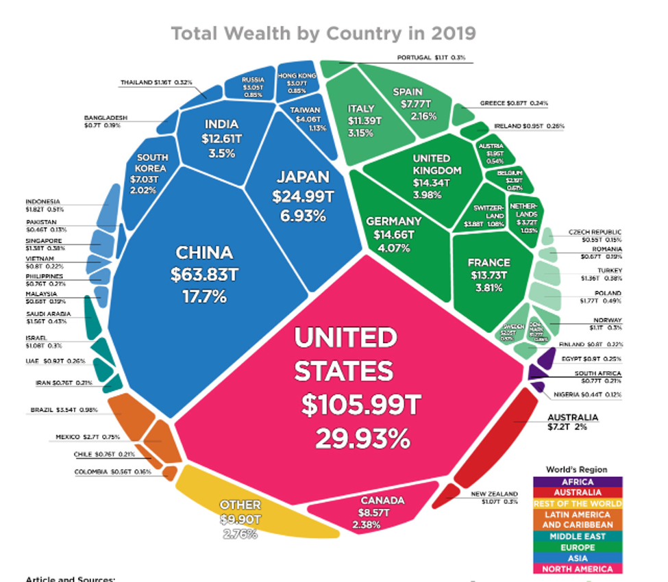
Courtesy – Visual Capitalist (http://www.visualcapitalist.com)
However, when creating a visual, one must keep in mind that the meaning of the data is not lost. Edward R. Tufte, in his book ‘The Visual Display of Quantitative Information,’ writes that excellence in statistical graphics consists of complex ideas communicated with clarity, precision, and efficiency. Graphical displays should:
- Show the data
- Induce the viewer to think about the substance rather than about the methodology, graphic design, the technology of graphic production, or something else
- Avoid distorting what the data have to say
- Present many numbers in a small space
- Make large data sets coherent
- Encourage the eye to compare different sets of data
- Reveal the data at several levels of detail, from a broad overview to the fine structure
- Serve a reasonably clear purpose: description, exploration, tabulation, or description
- Be closely integrated with the statistical and verbal descriptions of a data set
So what does this mean for the banking and financial services world? Think about the vast amounts of data captured each day, and the deep level of insight we can gain by using visuals rather than words.
Take for example mobile devices - their adoption and use have skyrocketed in the past few years. More than ever, people today use their mobile devices for some or all their banking needs. Most of the consumers accessing financial services through their smartphones cite convenience as their reason. The Federal Reserve Bank, in their Consumers and Mobile Financial Services Report of 2016, reported that:
- Use of mobile banking continues to rise.
- Fifty three percent of smartphone owners with a bank account had used mobile banking
- The three most common mobile banking activities among mobile banking users were
- Checking account balances or recent transactions
- Transferring money between an individual’s own accounts
- Receiving an alert
In this landscape, there are multiple points of data generated in each interaction of a customer with their financial institution and data is the greatest untapped source of value for banks. We at Alogent recognized the potential and developed a system to cater to this need – AWARE. From AWARE’s first release in 2015 to today, we have continued to enhance the product and integrated it with third party data visualization tools like Power BI to help financial institutions take control of the data that they are generating, especially through the deposit channels and create meaningful representations of the same.
Remember, “a picture is worth a thousand words,” and if we can provide you a clear, holistic view into your financial institution without having to read words or paragraphs, imagine the efficiency and clarity gained.
Learn more about AWARE at alogent.com/bank-solutions/analytics-and-reporting.